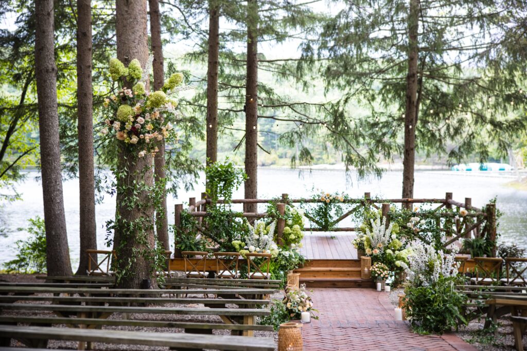
Examples of wedding venue websites
As part of our wide range of experience running Google Ads PPC campaigns for wedding venues, we’ve put together a short guide looking at some of the good and bad points of a range of wedding venues.
Use this guide for inspiration when looking at your own website and marketing efforts.
Also check out our full guide to marketing your wedding venue using Google Ads, and how to efficiently fill your venue calendar. Check out the guide here.
1. Sandhole Oak Barn
https://www.sandholeoakbarn-weddings.co.uk/
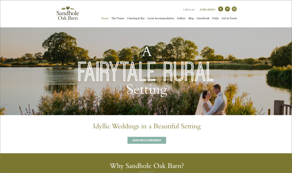
This wedding venue is located in Congleton in Cheshire and we really like the clean imagery on the home page along with the clear font which clearly calls out that this is a rural venue for couples specifically looking for that.
The imagery on the website is of a high standard and the navigation is easy to use.
The menu is clear and simple to use and covers the main areas which a couple would be likely to need.
The FAQ section is also very nice, answering some of the core questions right at the front of the website around venue capacity, dancefloor size (mentioned for bands), disability features and catering details.
The Gallery contains a wide range of high quality photos and is divided into sections “Spring, Summer, Autumn, Winter” to give potential couples a view of the venue year round.
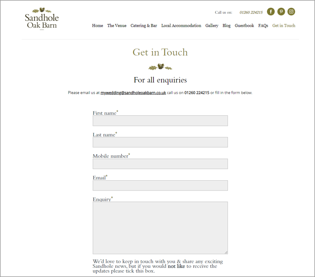
The contact form is also very easy to use, short and to the point.
2. Eden Barn in Cumbria
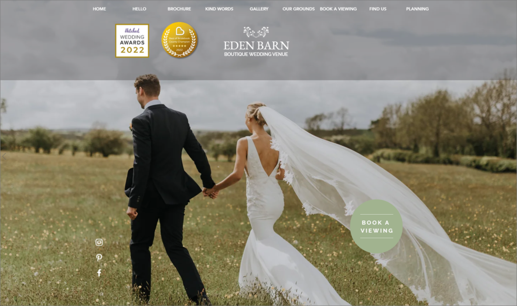
This is a great example where there are a lot of good things on the website, but also areas which could be improved for a better experience to help couples find the information they need more quickly, and potentially reduce admin time in communication.
The imagery on the homepage is both evocative and high quality. Showcasing the beautiful location of the venue, and the venue itself.
The menu is clear and easy to use and also calls out the key areas that couples are likely to look for including
- Brochure
- Gallery
- Our Ground
- Book a viewing
- Kind words
The kind words are a nice section to contain, but in this case you can’t scroll through the section on the website and its just left to auto-rotate through 3 testimonials from couples. There is a lot of text here to read, and it should be considered moving into its own section where potential couples can read with more detail rather than auto-scrolling.
The website highlights the Hitched Wedding award which is a good reassuring message
The contact form is also easy and simple to use.
There are some areas which we believe could improve the user experience on the website however:
- We find the scrolling of the images to fast on the main homepage and the way they swipe across very quickly
- The website is built on a single page so when you click the links in the main navigation menu, the whole website scrolls through to get to the section you have clicked
- This means that you need to wait while you move down the page
- And the menu then disappears from the top, so if you would like to move to a different section of the website, you need to scroll all the way to the top to find the menu
- The venue can seat up to 144 people but this information is further down the page and quite hard to find
By providing some of this information further up the page, you can give potential couples some of the core information they need
This may also reduce admin time when communicating and answering emails as some of the core questions which would take time answering could already be provided before a couple contacts.
So while the imagery is beautiful and does an excellent job of showcasing the grounds and venue, there are some areas which could be be improved to provide a better experience, and more importantly help couples easily find the the information they are looking for.
The brochure is professionally done and provides excellent imagery and information on every aspect of the wedding and venue.
3. Rivervale Barn- Hampshire
https://rivervale-barn-weddings.co.uk/
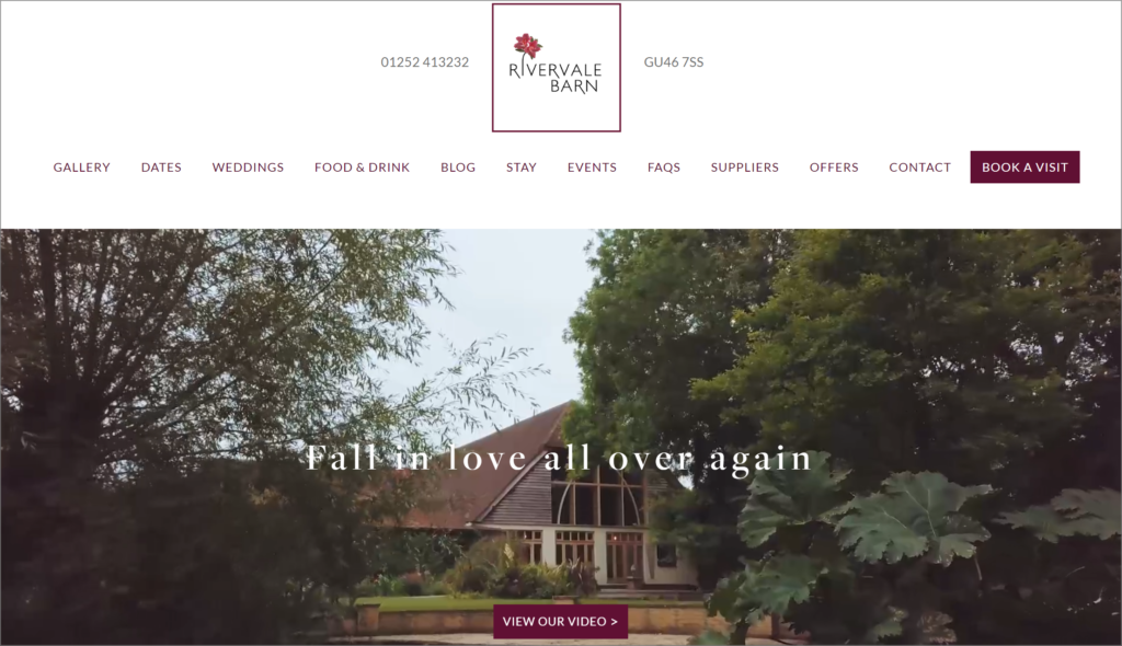
While the screenshot below may look relatively basic, it actually plays through a very nice video that showcases the venue from first thing in the morning to an evening reception in just a few shots.
This demonstrates the venue turning from morning to night which couples are likely to want to see as the evening party can be just as important as the day reception.
The site also contains a two good pieces of information right at the top, both the phone number on the left side of the logo and the postcode on right hand side. It would be great if the postcode took the user directly to a maps page with address.
This does work on the mobile site but not on desktop
Other things we like:
- The gallery page is very nice with a wide range of photos
- Food and drink page does a very good job of showcasing the food available with a wide range of vibrant photos
- There is an easily accessible Frequently Asked Questions page with Q&A around capacity, parking, children amongst other questions
- The accommodation
Areas which could be improved:
- There is an online date checker which should be a very nice feature but it does not show actual availability which could frustrate visitors
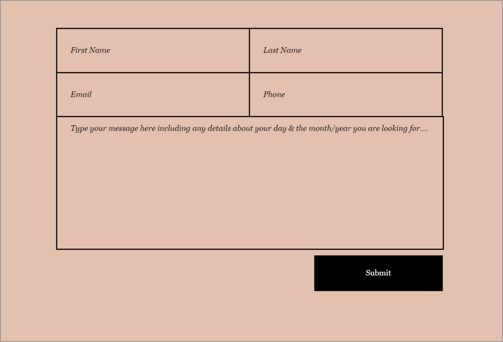
- Book a visit page is a contact form where you can select dates, rather than showing availability for a visit – In one sense this is useful for the venue as they will have that piece of information when the form is submitted, but again may be frustrating for users that you can’t pick a date
- The FAQ page does not mention accommodation
Overall though the website and the venue is well presented and is likely to give couples a good overview of the venue and offer.
4. The Old Kent Barn – Kent
https://www.theoldkentbarn.co.uk/
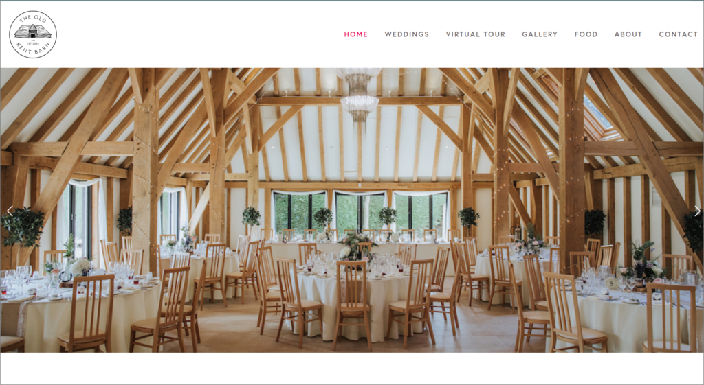
The Old Kent Barn website is clean and easy to use, with a simple navigation bar at the top, a wide range of high quality photos in the gallery cover all aspects of a wedding, along with some nice, personal information on the food and head chef.
The contact page does not have a form which is unusual, but just a telephone number and email address. This is something which may have been tested, and if a potential customer calls rather than filling in a form it may be better from the start to have a human conversation rather than a blank email reply.
The office hours are included too which is nice.
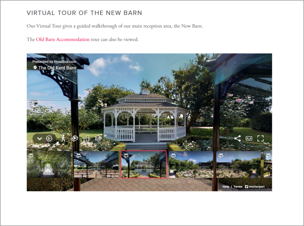
The website also contains a virtual tour where you can zoom in to and view 360 degrees to just about any point in the venue. Sometimes this kind of feature could be clumsy but in the case of The Old Kent Barn it is very well done. When implementing a new/more technical feature such as this, it really pays to do this well and offer a good experience.
A screenshot of the virtual tour, link here is below
5. Preston Court – Kent
https://www.prestoncourt.co.uk/
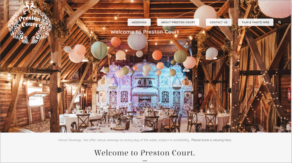
The Preston Court website is beautifully put together showcasing the venue in amazing detail with high quality photography through a wide range of the venue.
Right below the main image on the homepage, the website states “One of the world’s top 10 barn weddings” as rated by Bridalmussings.com
That’s quite an accolade so its not surprising to see it right at the top to give potential couples trust and reassurance.
The website is very well presented, with enough information to highlight the features while not being overwhelming.
There are a range of contact options and once you have contacted the venue and received a password you can then view potential dates online. Again at this point when a customer see’s “suitable dates” they may expect to see this directly online rather than having to contact and create a password first.
Summary
We’ve looked at a handful of different website examples covering areas we like, and areas we think could be improved.
Its always important to remember that you need to show off the style of your venue as it is. What is right for one website may not be for another.
What is imperative though, is it offer clear and concise information, and photography which will showcase the whole venue, both inside and outside.
Frequently Asked Questions are a great way to provide some key information in a fast, digestible form. In fact, when we review Google Ads campaigns and Google Analytics for wedding websites, the FAQ pages are often in the top 10 pages visited on the site.
And apart from the homepage, usually within the top 3 links are downloads to a brochure.
First an foremost, try to see your website in the frame of mind of a potential couple – What do they want to know about the venue, can then contact you easily, and what information isn’t as important to them?
If you’d like help with getting your venue more showarounds, brochure downloads and contacts from couples through Google Ads – Reach out to our experienced team today.
